Example: Student services
From TAFE NSW's student services webpage
Ineffective visual design is not limited to graphs and charts. Sometimes, communicators can get so preoccupied with making a webpage look visually attractive that they end up neglecting their main aim, to communicate a simple message.
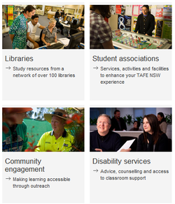
The example shown here is from TAFE NSW's student services landing page. It is a webpage designed to filter users through to the part of the site that caters for them. Essentially it is a portal which serves a similar function to that of a table of contents in a printed publication or a drop down menu in a standard website.
See below for a capture of part of the page – it was too large to capture the entire webpage. Alternatively you can see it for yourself at TAFE NSW's student services page.
If this webpage is designed to filter people through to deeper content quickly and efficiently, it is working against itself by spreading the links over the entire webpage, including below the fold. (The 'fold' is the point where the user must scroll down to see more content.) This is a big mistake for a landing page such as this. Not only is the text visually separated too much, but the use of a generic photograph for each link – 11 in total – further exacerbates the issue. And as with all stock photos, these photos only distract the user from reading the text and clicking through to the actual content.
The photos used may not actually be stock photos and may well be real people. However they have a generic feel about them. There is nothing wrong with using these photos as examples of people at TAFE or to provide a general sense of personality to the content, but they should be used on deeper content pages, not on a landing page.
All in all, they have made it very difficult to navigate through their content and therefore this is an ineffective use of visual design online. A simple list of services would have done the job.
