Using visual elements online
This website aims to convince online communicators to start incorporating more visual elements into their communications, especially for information-based websites. There are examples of both good and bad visual elements on this site.
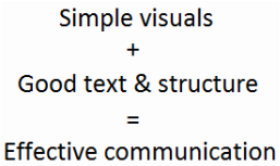
Despite the name of the website, I have nothing against people reading! By naming this site Don't Make Me Read I am merely making the point that if you want people to engage with your content and understand the point you are trying to make, you shouldn't force your readers/users to read complex text. By including (often simple) visual elements you can potentially reach more people, establish yourself as a good communicator and your message is more likely to be retained by readers/users. It should be the communicator that does the hard work, not the reader.
Despite the name of the website, I have nothing against people reading! By naming this site Don't Make Me Read I am merely making the point that if you want people to engage with your content and understand the point you are trying to make, you shouldn't force your readers/users to read complex text. By including (often simple) visual elements you can potentially reach more people, establish yourself as a good communicator and your message is more likely to be retained by readers/users. It should be the communicator that does the hard work, not the reader.
|
This website is part of my final assessment for my Master in Communication degree which I am studying at Griffith University, via distance education through Open Universities Australia. Once the course is completed and I have received my final results at some stage in November 2011 - fingers crossed - I will refresh the site and continue to build reviews of online visuals and provide links to other works of interest, so long as you want me to.
In the meantime feel free to post anything as a comment on the blog or to contact me.
In the meantime feel free to post anything as a comment on the blog or to contact me.
