Example: Pump and dump
Let's take a look at what I consider an effective use of a visual element online on the Australian Securities and Investment Commission's MoneySmart website. See below for the visual and text copied straight from the site as well as a link to the full article.
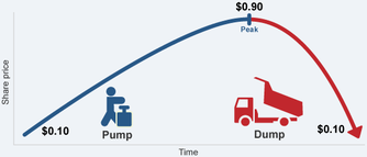
Shares bought at 10c and dumped at 90c.
"Scammers buy shares in a small company at a low price. Then they send out false tips about the company having great prospects. As more people invest, the share price goes up and the scammers sell their shares at the peak of the price rise. Then the share price falls and the shareholders are left holding them at the reduced value."
Reference: MoneySmart's article on inflating the share price scams.
Reference: MoneySmart's article on inflating the share price scams.
The aim of this article is to explain to readers/users how this specific type of financial scam works and how to avoid them. These type of scams have been around in various forms for many years but in recent times have become prominent again, in particular in the emerging mining investment area. So there is significant motivation for the people communicating this message to make it easily accessible. Also, the victims of such scams can come from any walk of life - scamsters tend not to discriminate against who they rip off. That means that this web content has to be helpful for people of all levels of literacy, investment experience and so on.
If the writers of this content had chosen to explain this scam using text only it would have limited the reach of the content.
Why is this an effective visual element?
The figures used are easy to understand because it uses fairly basic arithmetic. The graph is colour coded with blue for the upward pump and red for downward dump. This makes the comparison easy for the user to identify. The cartoon-style images of the man using a pump and a truck dumping it’s load have meaning and are not purely decorative. The images reinforce the concept behind the scam and makes it potentially more likely that he messages will be retained by the user. The graph supports the associated text well because it brings an example to life.
This is a simple and effective visual.
