Example: Monetary policy
You can't look at the good without looking at the rest. In some ways I feel bad picking on the Reserve Bank of Australia (RBA) because a lot of their communications are very effective and innovative. However the graph I have selected here is not.
See below for the visual and text copied from the RBA or check out the full article About monetary policy.
See below for the visual and text copied from the RBA or check out the full article About monetary policy.
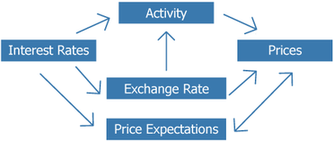
The Transmission of Monetary Policy to the Economy.
"The changes in interest rates affect economic activity and inflation with much longer lags, because it takes time for individuals and businesses to adjust their behaviour. Interest rates affect economic activity via a number of mechanisms (Graph 4). They can affect savings and investment behaviour, the spending behaviour of households, the supply of credit, asset prices and the exchange rate, all of which affect the level of aggregate demand."
This content sits towards the end of a very lengthy webpage on monetary policy. Now, communicating on such a technical topic is never easy and the RBA generally writes for a more technical audience, or so I assume based on the tone of voice and financial jargon used on their site.
There are a number of pretty good visuals on this webpage such as the one that aims to show the close relationship between the cash rate with 90 and 180 day bills. However I cannot understand why they chose to include the amazingly named "graph 4".
Presumably the specific aim of this section of the webpage is to explain to users the relationships between interest rates, exchange rates and prices. At this point we need to remember that the financial system has one of the most complex frameworks imaginable. To attempt to explain this in a simple graph is an (almost?) impossible task.
I'm not against graphs of this style at all. However, despite the fact that the graph is small, it is very complex with arrows going in many directions. In particular, the arrow with two heads pointing each direction to and from 'prices' and 'price expectations' boxes offers no insight other than that these two factors affect each other. It is difficult to know where the user is supposed to look first as there is no obvious start and end to the graph. It is also very confusing that there is a factor named 'activity' when normally you would expect some sort of activity taking place with all the elements, that's normally what arrows signify.
The graph sits in the middle of some complex text that, in a highly technical way, explains how monetary policy impacts the economy. Does the graph help the reader understand how that works? Well, it certainly didn't help me and I'm a professional financial services communicator.
How could this be improved?
Whoever created this graph has good intentions, but in my opinion they were biting off more than they, or anyone else, could chew. They needed to break the issues down further, as they had done with previous graphs on the webpage, and focus on less complicated components of the economy individually. Interest rates appear to be the main focus of the text surrounding the visual element, so it may have been more effective to show how all the factors are affected by interest rates with some very brief explanatory labels.
