Example: Australia's tallest buildings
Wikipedia is an amazing example of online collaboration that is driven by users. Ideally, what appears on screen for everyone to see is the result of experts and online communities drafting and editing each others' work to create up to date content on any topic. With this freedom and the ability to edit other peoples' work comes risk, but the advantages definitely outweigh the risks so long as the user knows how the content is drafted.
In this environment where users are in control, there really is no place for ineffective content whether it be text or visual. In order for a visual element to stay live on Wikipedia, online communities must agree that it adds value - they must find it useful.
Below is what I consider an effective use of a visual element online. The visual and caption is copied straight from the site and here is a link to the full Wikipedia article.
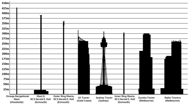
The current tallest buildings and structures in Australia.
The aim of this Wikipedia article is to explain to readers/users what are the tallest buildings in Australia and associated details. It is fair to assume that this content would be used mainly by students and people searching for simple answers to the quizzical question: what is the tallest building in Australia? This is not a complex question and nor is the answer complicated.
The most obvious way to display this information is in a table and that is how it is initially presented in this Wikipedia article. But the collaborators did not stop there. Perhaps recognising that buildings are a very visual thing and that many younger people may be searching for this information, the collaborators chose to include a column graph with the buildings' heights respresented by shadowed outlines of the real buildings.
Why is this an effective visual element?
The graphic is simple. The figures used are easily comparable when shown together. The graph builds on the user's existing knowledge of buildings to show them side by side. The graph is mainly black as opposed to using fully illustrated images of the buildings which I have seen in other similar graphics (for example, as shown here). This is good because I suspect the colourful and attractive illustrated versions distract from the main message, which is the data about which buildings are tallest.
The simple graphic in this Wikipedia article make it easy to interpret the comparison that is being shown and that's why it is an effective visual.
